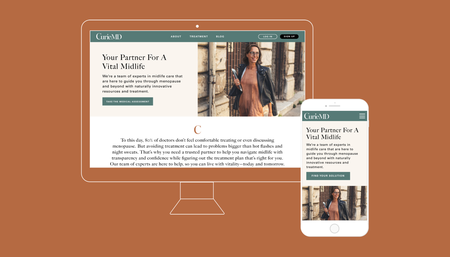
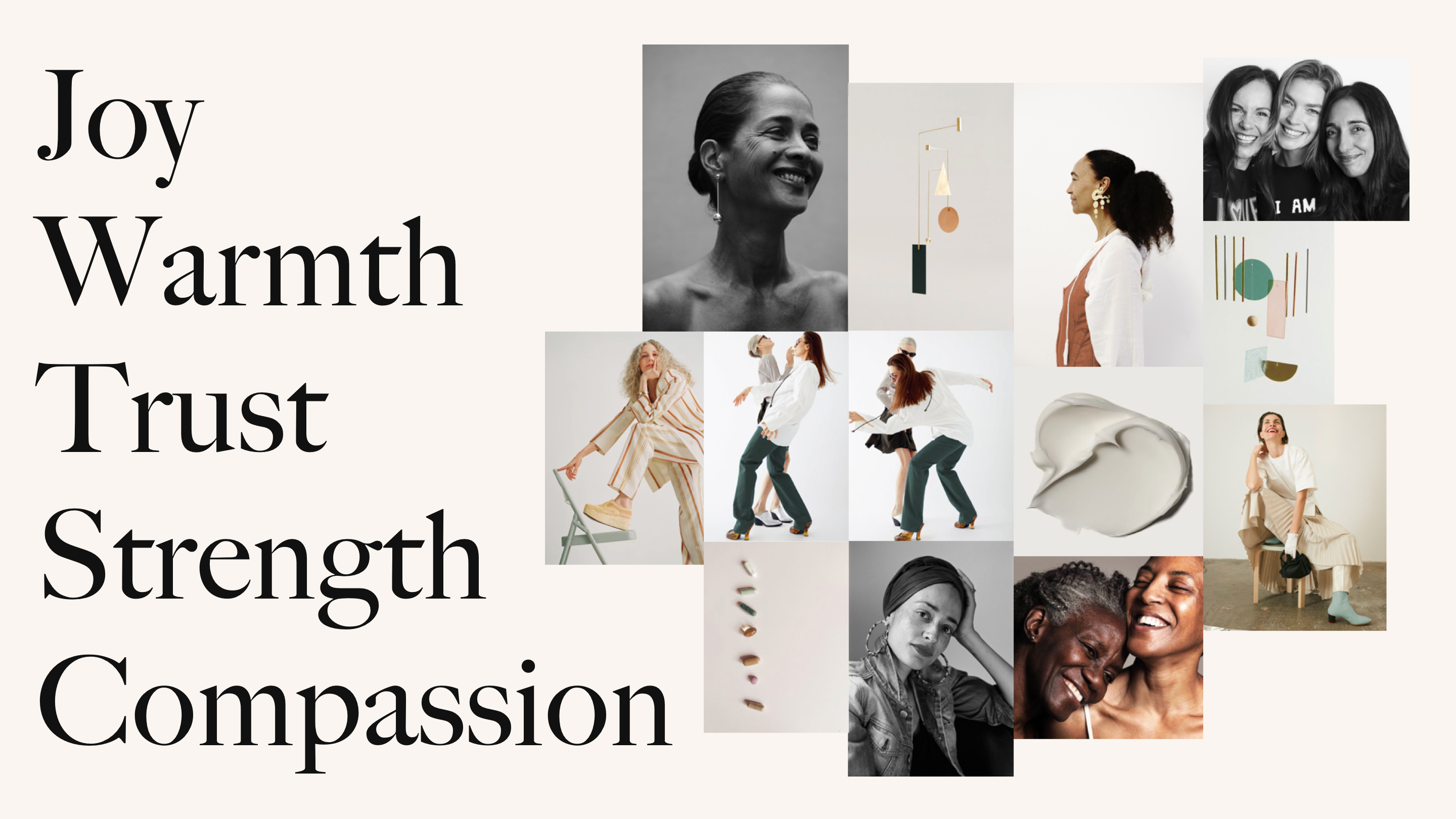
CurieMD approached Worn Agency to build a brand for an audience that’s long overdue for representation. The creative team and I recognized that women in midlife are vibrant and essential — and our goal is to not let menopause symptoms get in the way of that.
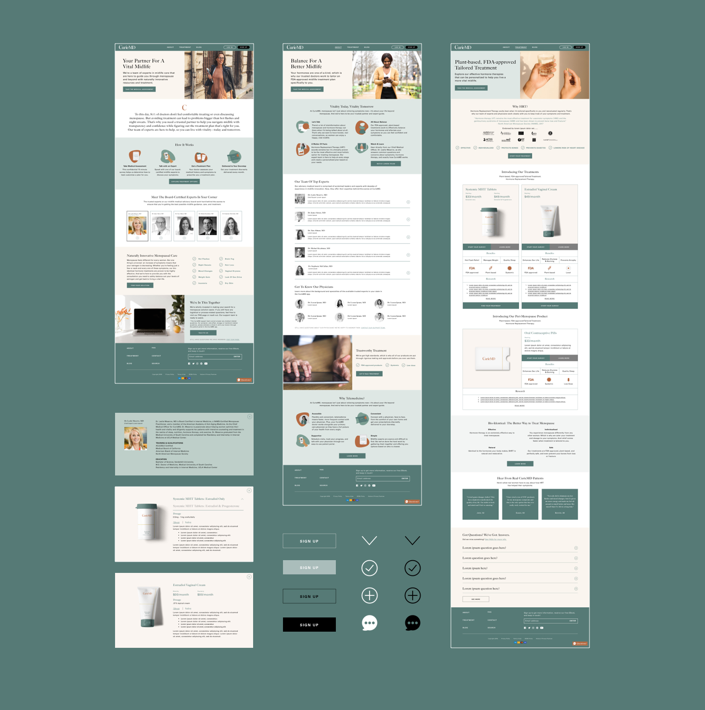
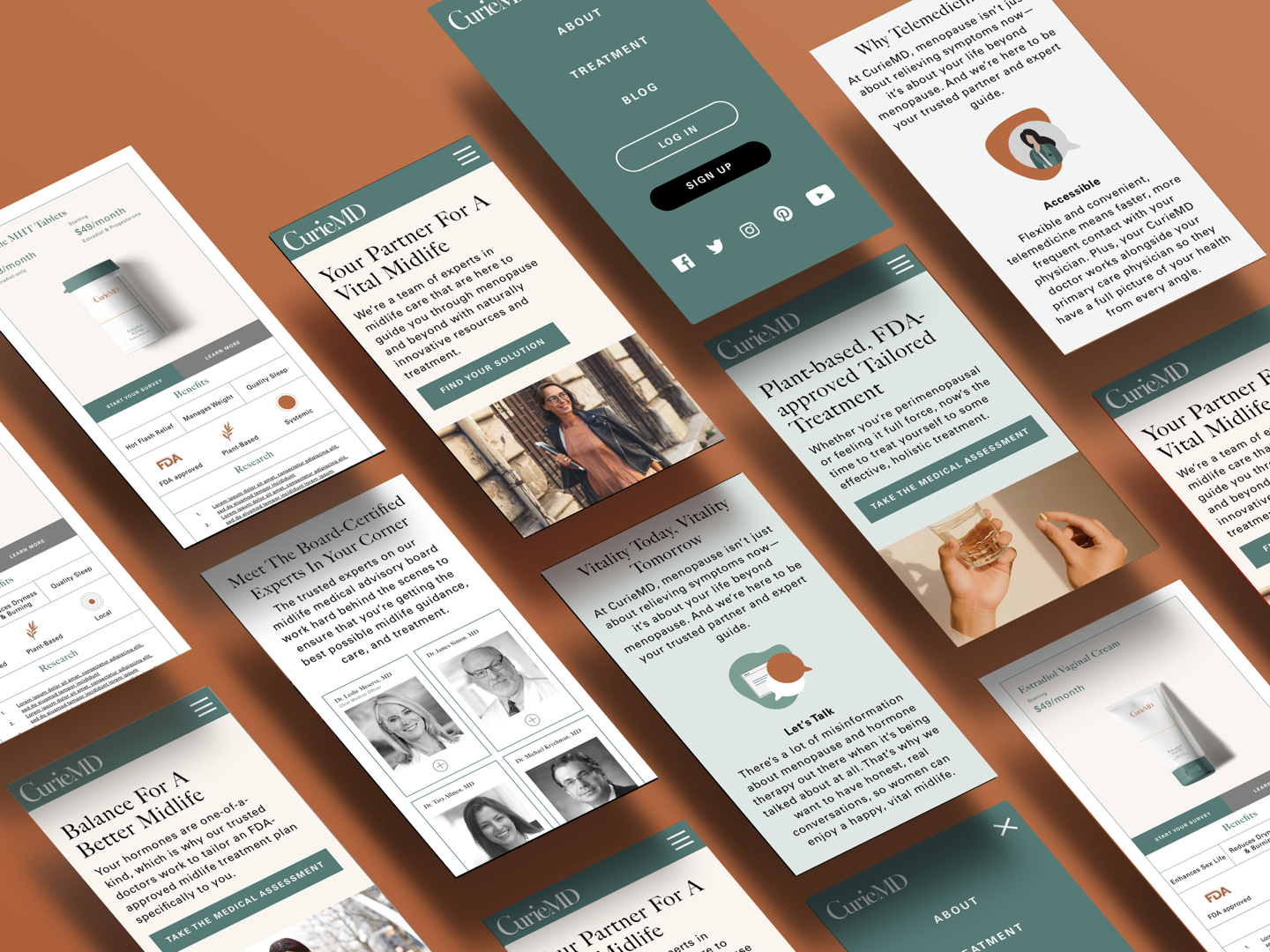
Through extensive research, focus groups, and surveys the strategy team and I developed a thoughtful menopause brand that addresses not only the symptoms and solutions of menopause, but also how to live a vital midlife. I designed the logo, illustrations, and digital experience.
CurieMD approached Worn Agency to build a brand for an audience that’s long overdue for representation. The creative team and I recognized that women in midlife are vibrant and essential — and our goal is to not let menopause symptoms get in the way of that.
Through extensive research, focus groups, and surveys the strategy team and I developed a thoughtful menopause brand that addresses not only the symptoms and solutions of menopause, but also how to live a vital midlife. I designed the logo, illustrations, and digital experience.
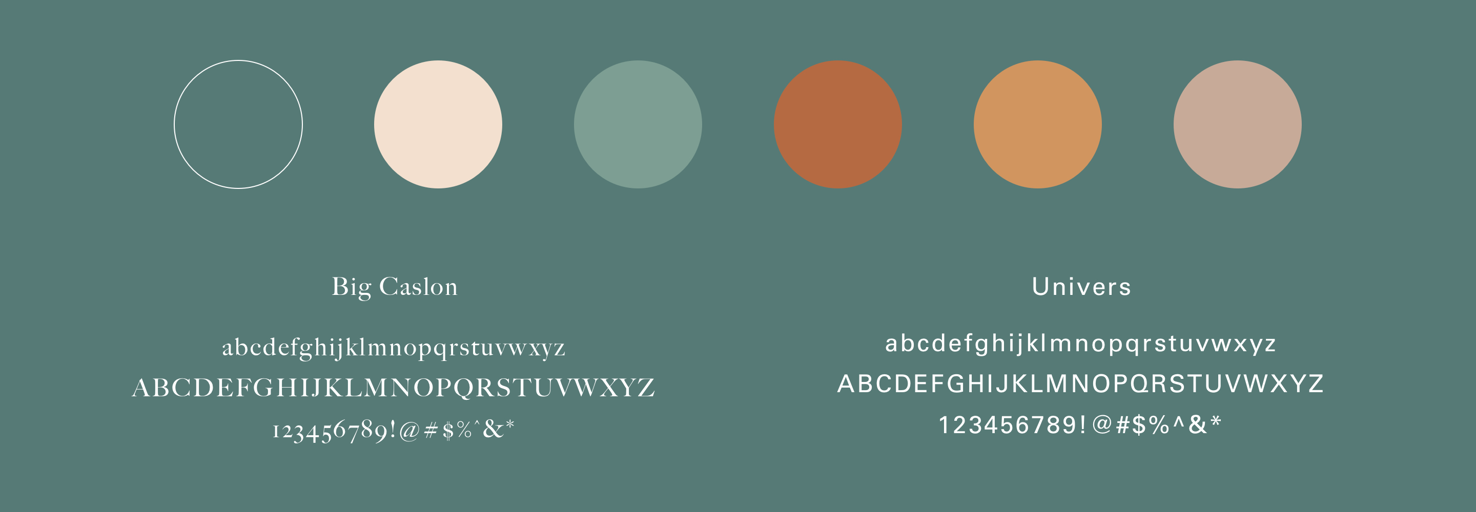
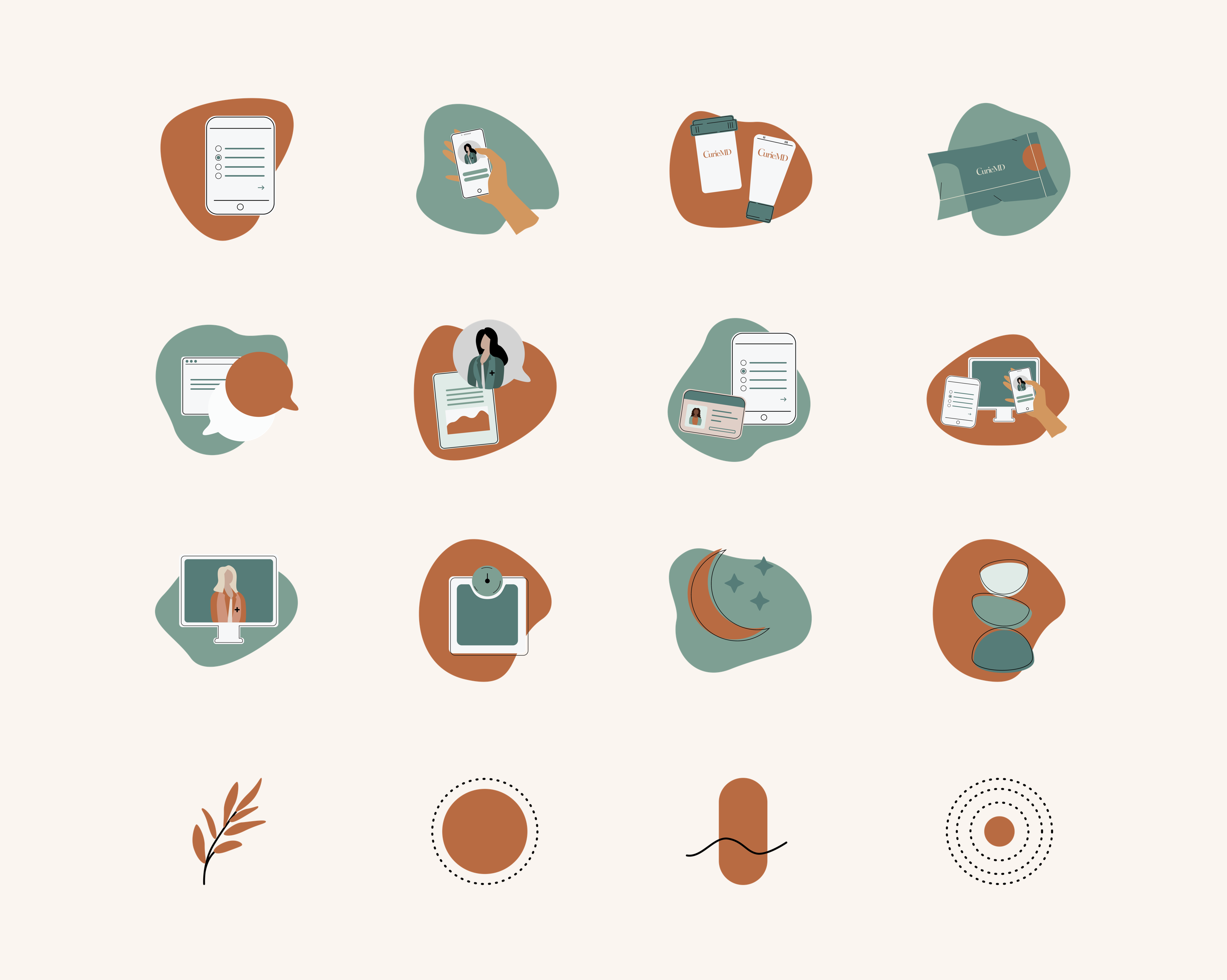
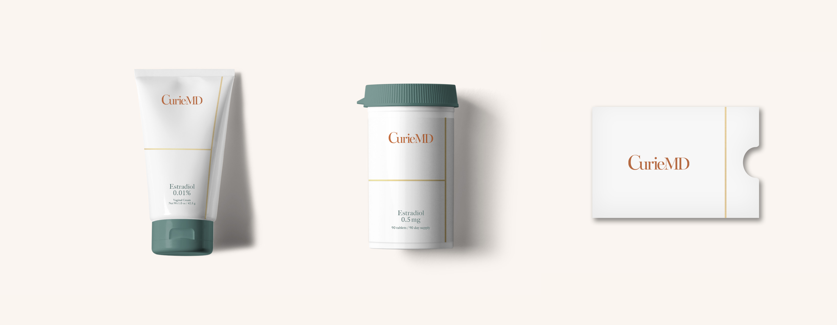
To convey professionalism and sophistication, I used a serif typeface, with thick and thins that are elegant in nature. By weaving together the letters of CurieMD, we’ve visually represented the partnership and connection the brand provides. The color palette conveys the vitality that women have during midlife. The primary green emulates a sense of health and renewal, while the cream, tan, orange, and dusty pink add vibrancy and balance to the green. I designed a library of illustrations that were clean and dynamic.
For the primary packaging, I wanted to make sure there was a balance of credibility with modernity. The ample white space provides a medical feeling, while the pop of deep green in the caps make it feel more contemporary and designed.
I customized a handwritten logo to bring elegance and dignity to a category that’s often infantilizing, adding a lean to the word mark to convey the strength and adaptability behind the brand name.
I created illustrative icons to easily convey the Willow standards: affordable, discreet, convenient, and no commitment.
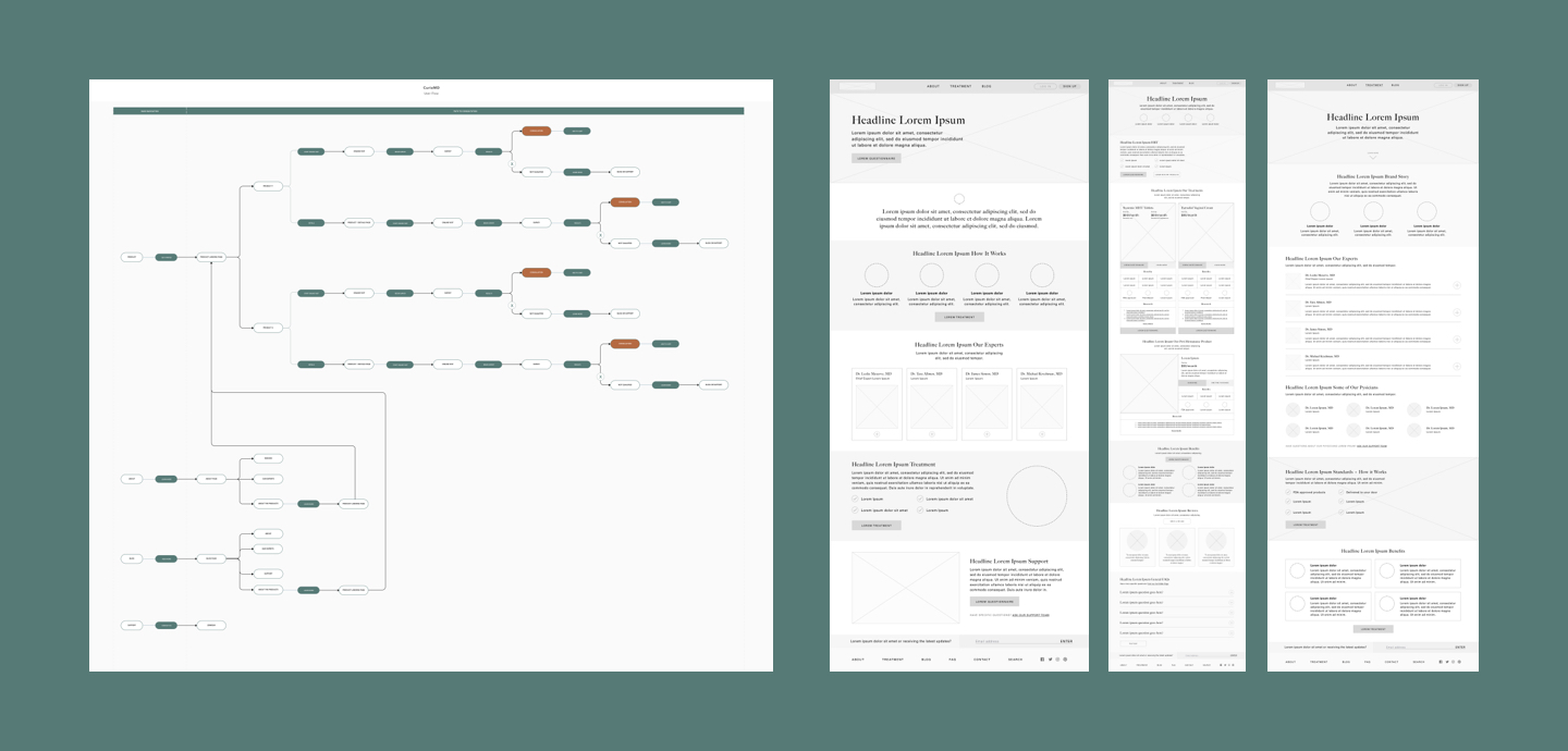
For the web design, I worked with Worn's strategy team to develop a flow and content strategy based on research. We used focus groups and surveys to test layouts, color palettes, content flow, and copy. Because of the age group, I was particularly mindful of the text and button sizes.
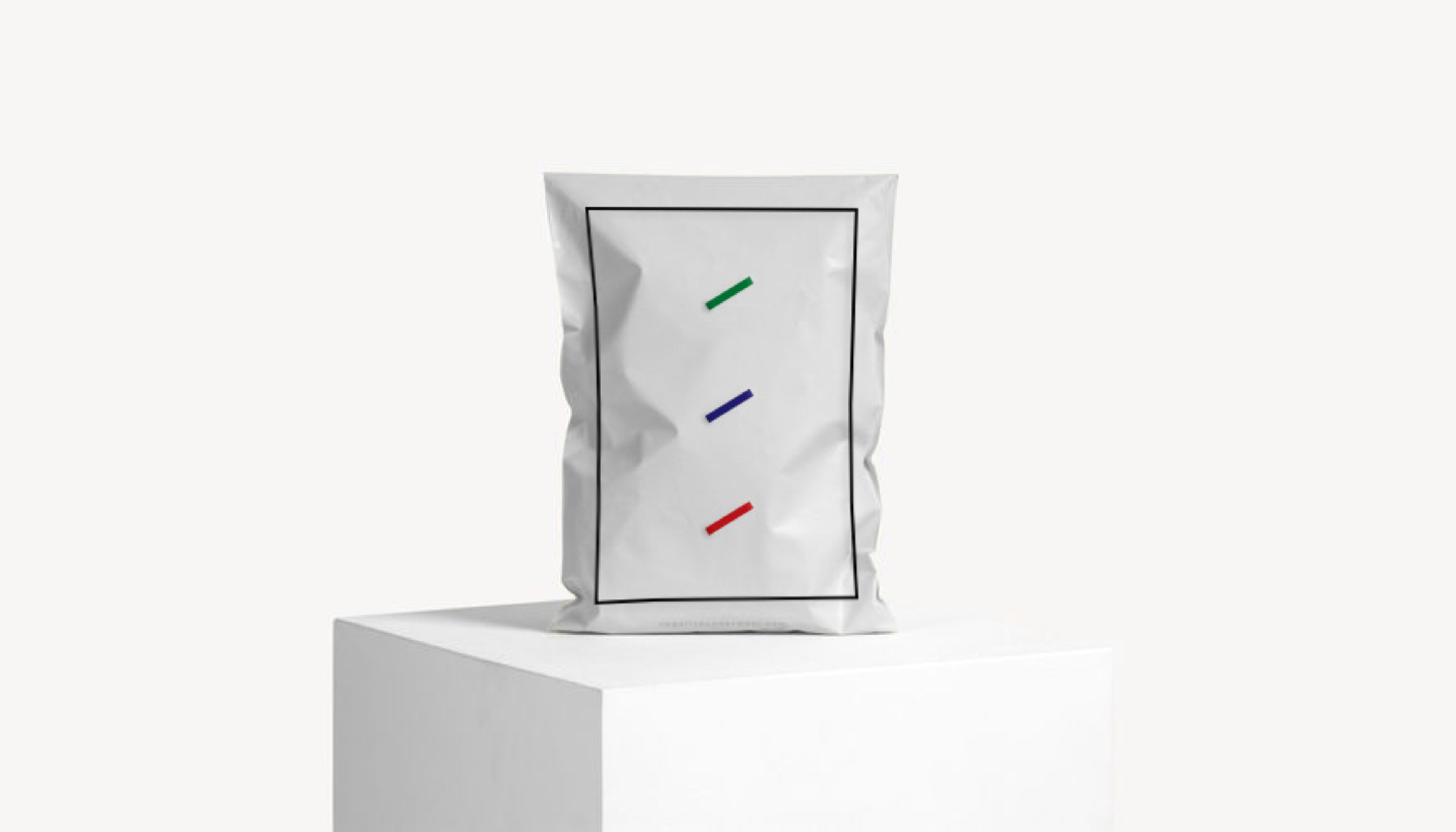
Contrary to the existing aesthetics of the category, I took a discreet and fashion-forward approach, using colors not normally paired with incontinence underwear: sand, mauve, cobalt, and orange.
ROLE - Art Direction, Concept, Logo, Branding, Packaging, Mobile-web design, UI, UX
AGENCY - Worn
CLIENT - CurieMD
ROLE - Art Direction, Concept, Logo, Branding, Packaging, Mobile-web design, UI, UX
AGENCY - Worn
CLIENT - Willow
PHOTOGRAPHER - Kronus Studio
Portfolio

AndieCampaign
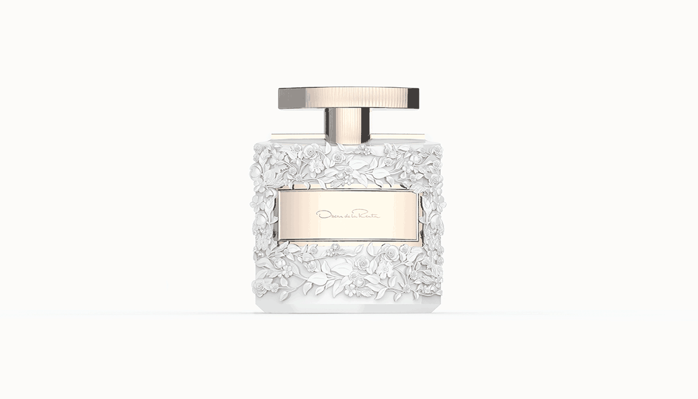
Oscar de la RentaPackaging, Product Design
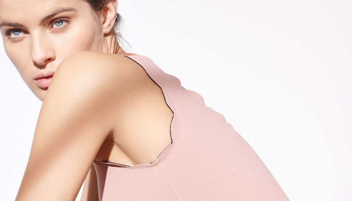
MarysiaBranding, Packaging
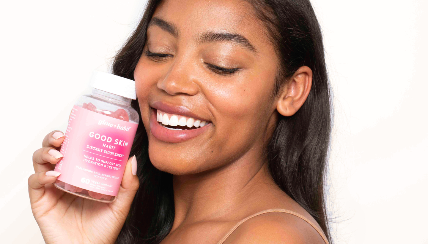
Glow HabitBranding, Web Design, Art Direction
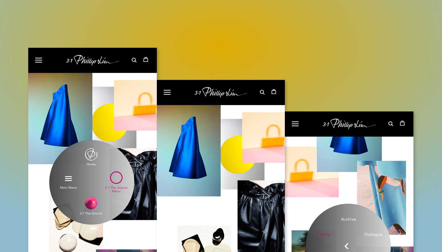
Phillip LimWeb Design
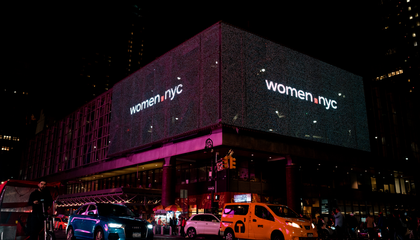
Women.NYCCampaign, Branding, Web Design
CurieMDBranding, Packaging, Web Design, Art Direction
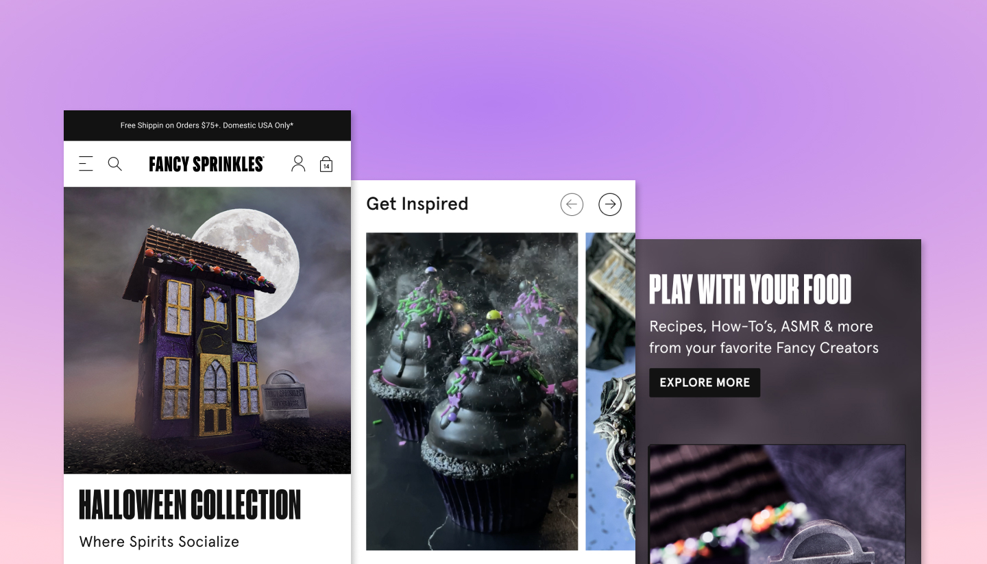
Fancy SprinklesWeb Design, Packaging Design
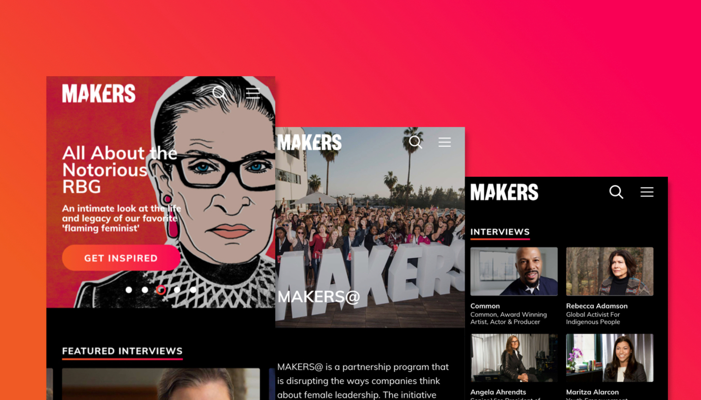
MakersWeb Design
Free AssemblyBranding, Packaging, Web Design, Art Direction